Use the interactive Queue monitoring dashboard to view when a launch queue is in heavy use or idle, visualize workloads that are running, and spot inefficient jobs. The launch queue dashboard helps you decide whether you’re effectively using your compute hardware or cloud resources. For deeper analysis, the page links to the W&B experiment tracking workspace and to external infrastructure monitoring providers like Datadog, NVIDIA Base Command, or cloud consoles.Documentation Index
Fetch the complete documentation index at: https://wb-21fd5541-docs-2661.mintlify.app/llms.txt
Use this file to discover all available pages before exploring further.
Queue monitoring dashboards are available only in the W&B Multi-tenant Cloud deployment option.
Dashboard and plots
Use the Monitor tab to view the activity of a queue that occurred during the last seven days. Use the left panel to control time ranges, grouping, and filters. The dashboard contains several plots that answer common questions about performance and efficiency. The following sections describe UI elements of queue dashboards.Job status
The Job status plot shows how many jobs are running, pending, queued, or completed in each time interval. Use the Job status plot to identify periods of idleness in the queue.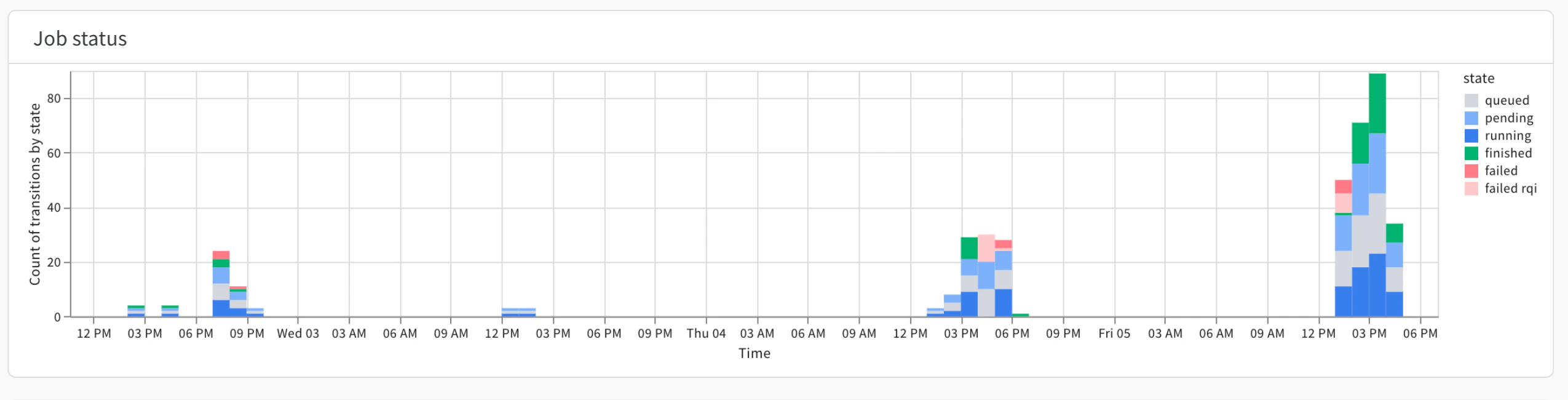
Queued items might indicate opportunities to shift workloads to other queues. A spike in failures can identify users who might need help with their launch job setup.Queued time
The Queued time plot shows the amount of time (in seconds) that a launch job was on a queue for a given date or time range.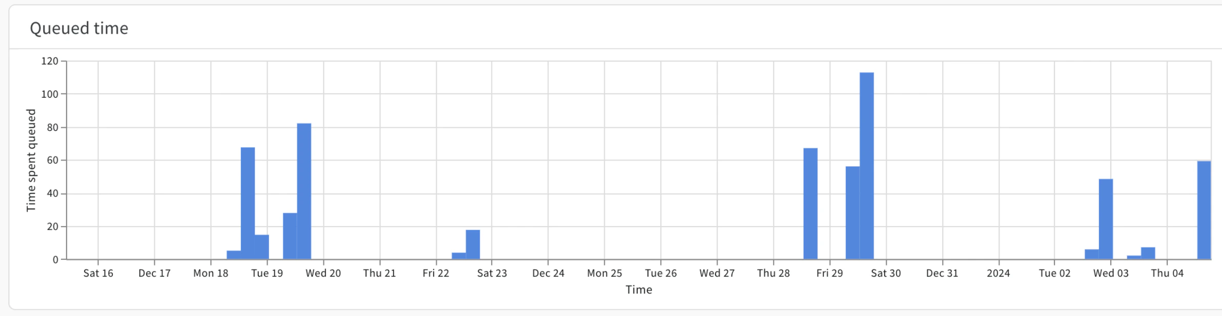
Use the Queued time plot to identify users affected by long queue times.
Job runs
The Job runs plot shows the start and end of every job executed in a time period, with distinct colors for each run. This lets you see at a glance which workloads the queue was processing at a given time.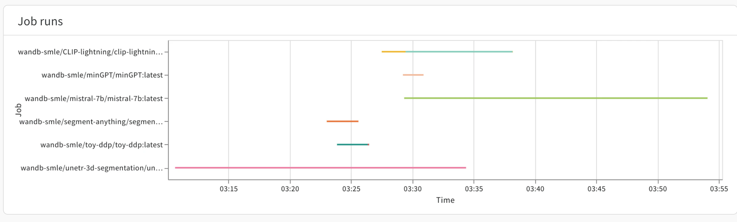
CPU and GPU usage
Use the GPU use by a job, CPU use by a job, GPU memory by job, and System memory by job plots to view the efficiency of your launch jobs.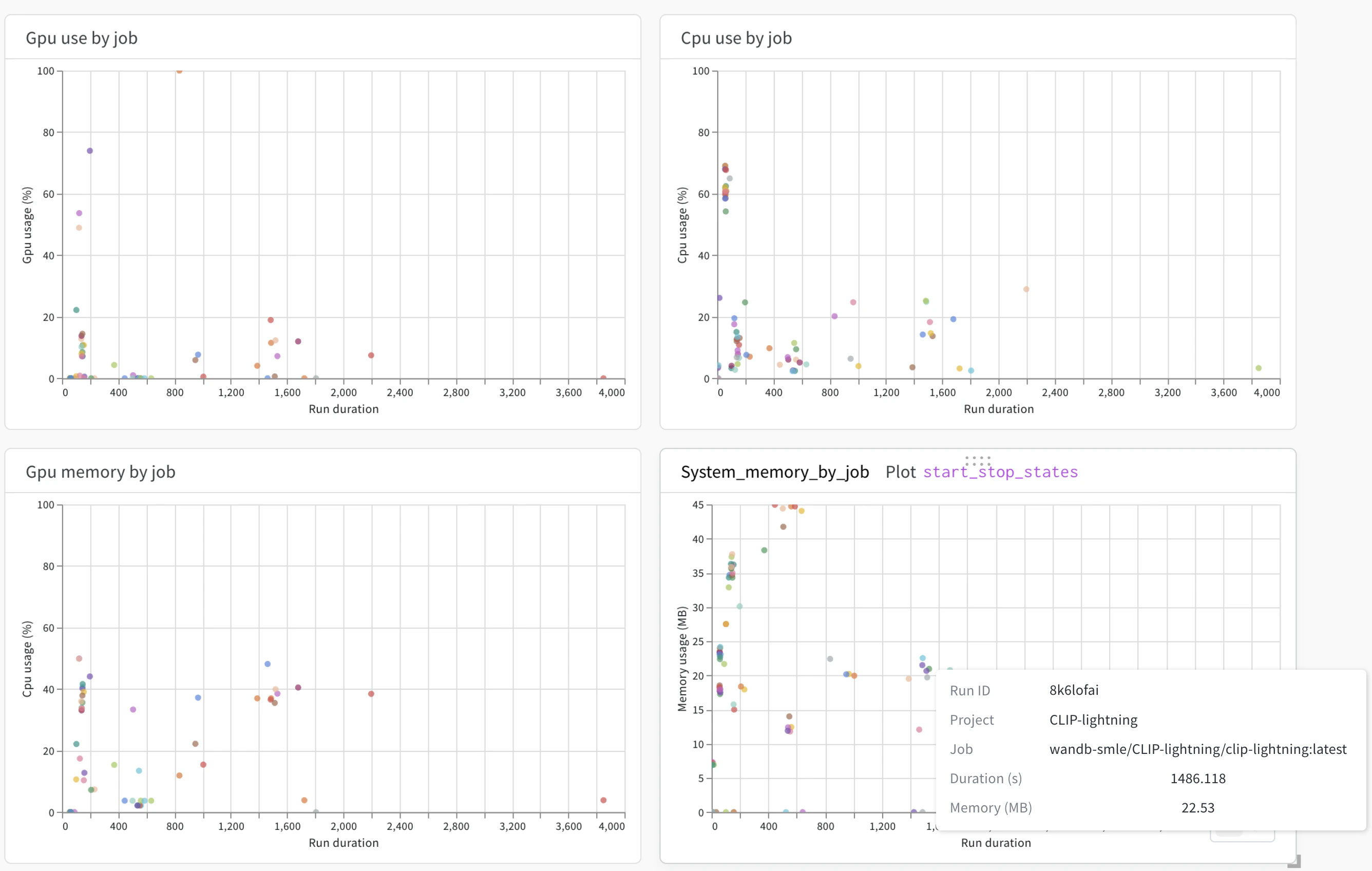
Errors
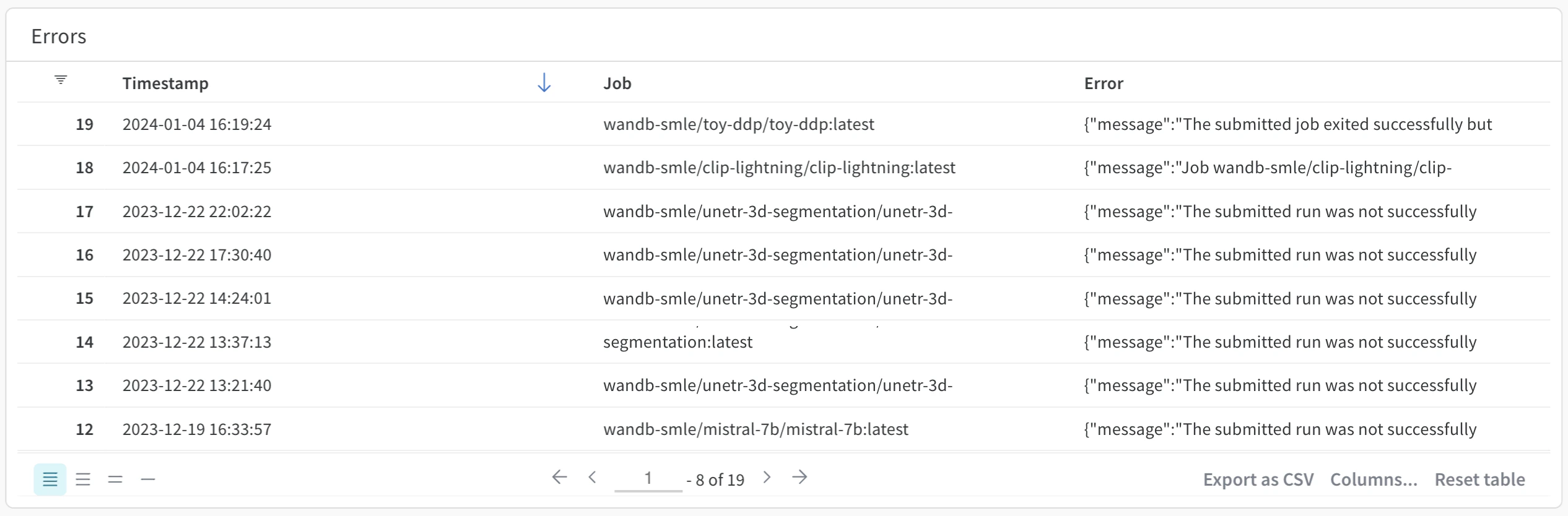
The Errors panel shows errors that occurred on a given launch queue. More specifically, the Errors panel shows a timestamp of when the error occurred, the name of the launch job where the error comes from, and the error message that was created. By default, errors appear in order from latest to oldest.