

Use point aggregation methods within your line plots for improved data visualization accuracy and performance. This page explains the two available aggregation modes and how to configure each one, so you can choose the right tradeoff between detail and rendering speed for your workspace. Two types of point aggregation modes are available: full fidelity and random sampling. W&B uses full fidelity mode by default.Documentation Index
Fetch the complete documentation index at: https://wb-21fd5541-docs-2661.mintlify.app/llms.txt
Use this file to discover all available pages before exploring further.
Full fidelity
Full fidelity is the default aggregation method and preserves the extreme values in your data. This section explains how full fidelity works, its main advantages, and how to turn it on for a single chart or an entire workspace. When you use full fidelity mode, W&B breaks the x-axis into dynamic buckets. The number of points per line adapts to chart size and the number of runs. It calculates the minimum and maximum values within each bucket (used for optional shading) and uses the last value in each bucket (not the average) to draw the primary line. Full fidelity mode for point aggregation has three main advantages:- Preserve extreme values and spikes: retain extreme values and spikes in your data.
- Configure how minimum and maximum points render: use the W&B App to interactively decide whether you want to show extreme (min/max) values as a shaded area.
- Explore your data without losing data fidelity: W&B recalculates x-axis bucket sizes when you zoom into specific data points. This helps ensure that you can explore your data without losing accuracy. W&B caches previously computed aggregations to help reduce loading times, which is useful when you navigate through large datasets.
Turn on full fidelity
W&B uses full fidelity mode by default. To configure it manually, follow these steps:- All charts in a workspace
- Individual chart in a workspace
- Navigate to your workspace.
- Select the gear icon on the top right corner of the screen next to the left of the Add panels button.
- From the UI slider that appears, select Line plots.
- Choose Full fidelity from the Point aggregation section.
- Configure the Smoothing algorithm and settings.
- Set Aggregation to Mean, Min, or Max.
- Click Apply.
Configure shading
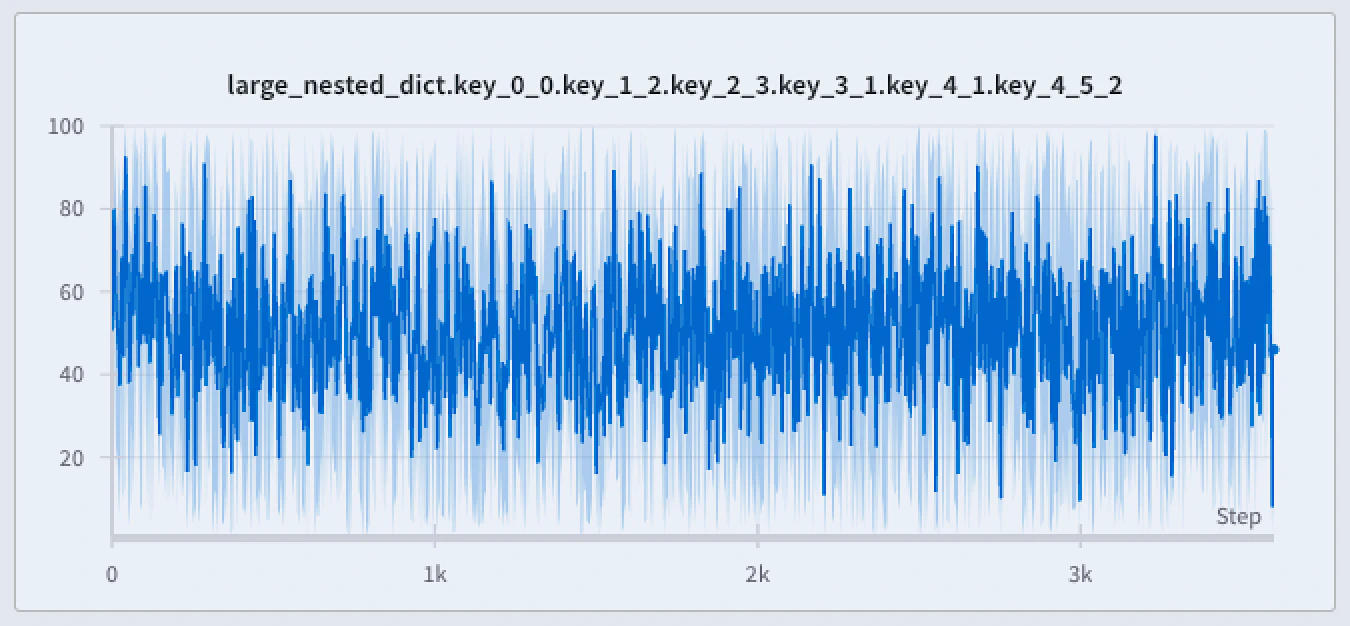
Shading visualizes the variability within each bucket so you can see how much points spread around the line. The shaded areas of a full-fidelity line plot can show:- Min/Max: For each x-axis point, shade the area between the minimum and maximum values. The shaded area shows all points from the lowest to the highest value in each bucket: where are the values in a given bucket.
- Standard deviation: For each x-axis point, calculate the variability of the values using standard deviation, and shade the resulting area.
- Standard error: For each x-axis point, calculate the likelihood of a sampling error by dividing the value by the square root of the sample size:
- None: No shading (the default).
- Navigate to your workspace.
- Hover over a line plot, then click the gear icon.
- In the Data tab, set Point aggregation to Full fidelity if necessary, then configure the smoothing algorithm.
- In the Grouping tab, turn on Group runs. Optionally, set Group by to a run attribute.
- Set Agg to Mean (default), Min, or Max.
- Set Range to Min/Max, Std Dev, Std Err, or None.
- Click Apply.
Explore your data without losing data fidelity
Analyze specific regions of the dataset without missing critical points like extreme values or spikes. When you zoom in on a line plot, W&B adjusts the bucket sizes used to calculate the minimum, maximum, and last value within each bucket.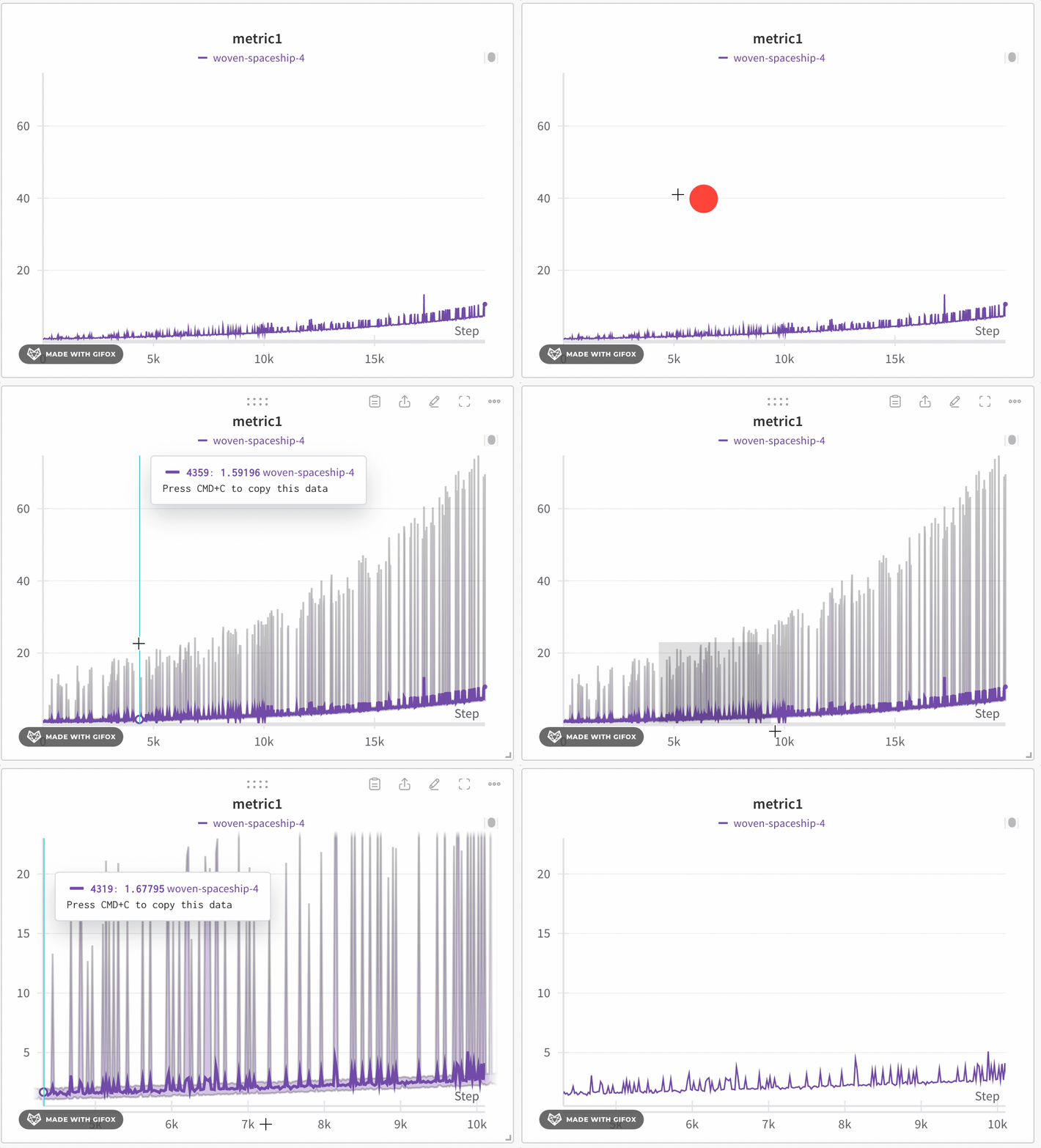
- Minimum: The lowest value in that bucket (used for shading).
- Maximum: The highest value in that bucket (used for shading).
- Line value: The last value in that bucket, used to draw the line.
- Navigate to your W&B project.
- Select the Workspace icon on the left tab.
- Optional: Add a line plot panel to your workspace or navigate to an existing line plot panel.
- Click and drag to select a specific region to zoom in on.
Line plot grouping and expressionsWhen you use Line Plot Grouping, W&B applies the following based on the mode selected:
- Non-windowed sampling (grouping): Aligns points across runs on the x-axis. W&B takes the average if multiple points share the same x-value. Otherwise, they appear as discrete points.
- Windowed sampling (grouping and expressions): Divides the x-axis either into 250 buckets or the number of points in the longest line (whichever is smaller). W&B takes an average of points within each bucket.
- Full fidelity (grouping and expressions): Similar to non-windowed sampling, but fetches up to 500 points per run to balance performance and detail.
Random sampling
Random sampling is an alternative aggregation method that prioritizes rendering speed over data fidelity. Use it when you need faster chart performance and you don’t need to preserve every extreme value. Random sampling uses 1,500 randomly sampled points to render line plots. Because sampling drops points, spotting outliers or spikes becomes more difficult.Enable random sampling
By default, W&B uses full fidelity mode. To enable random sampling, follow these steps:- All charts in a workspace
- Individual chart in a workspace
- Navigate to your W&B project.
- Select the Workspace icon on the left tab.
- Select the gear icon on the top right corner of the screen next to the left of the Add panels button.
- From the UI slider that appears, select Line plots.
- Choose Random sampling from the Point aggregation section.