

Parallel coordinates charts summarize the relationship between large numbers of hyperparameters and model metrics at a glance.Documentation Index
Fetch the complete documentation index at: https://wb-21fd5541-docs-2661.mintlify.app/llms.txt
Use this file to discover all available pages before exploring further.
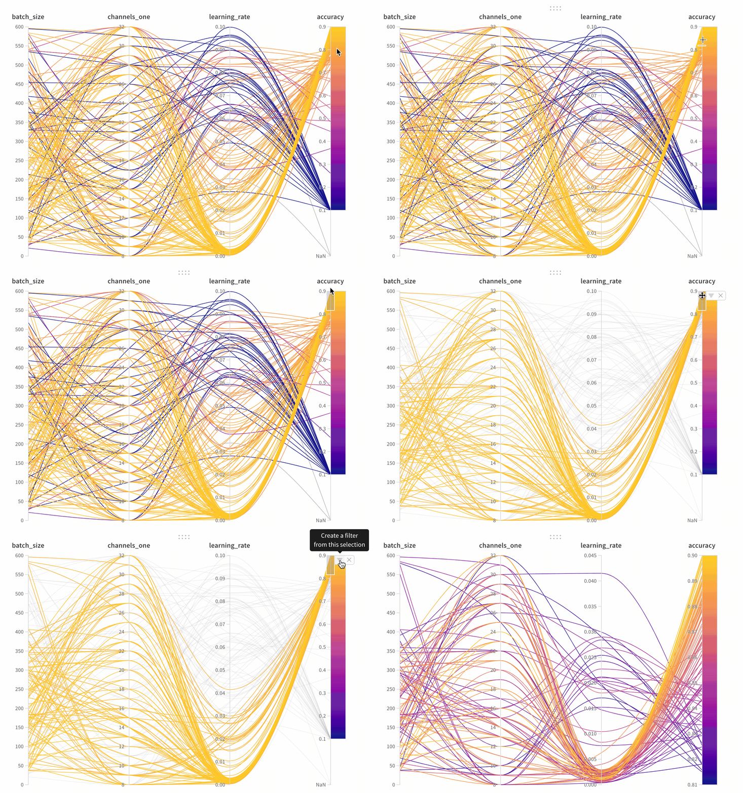
- Axes: Hyperparameters from
wandb.Run.configand metrics fromwandb.Run.log(). - Lines: Each line represents a single run. Hover over a line to see a tooltip with details about the run. All lines matching the current filters appear. If you turn off the eye icon for a run, its line is dimmed.
Create a parallel coordinates panel
To add a parallel coordinates panel to your workspace:- Navigate to the landing page for your workspace.
- Click Add Panels.
- Select Parallel coordinates.
Panel settings
To configure the panel, click the edit button in the upper-right corner of the panel. You can adjust the following settings:- Tooltip: On hover, a legend appears with information about each run.
- Titles: Edit the axis titles to make them more readable.
- Gradient: Customize the gradient to any color range.
- Log scale: Set each axis to use a log scale independently.
- Flip axis: Switch the axis direction. This is useful when you have both accuracy and loss as columns.