

Line plots display by default for metrics logged withDocumentation Index
Fetch the complete documentation index at: https://wb-21fd5541-docs-2661.mintlify.app/llms.txt
Use this file to discover all available pages before exploring further.
wandb.Run.log() over time. Line plots support plotting multiple metrics, calculating custom axes, and more.
This page shows how to create, configure, and manage line plots in a workspace.
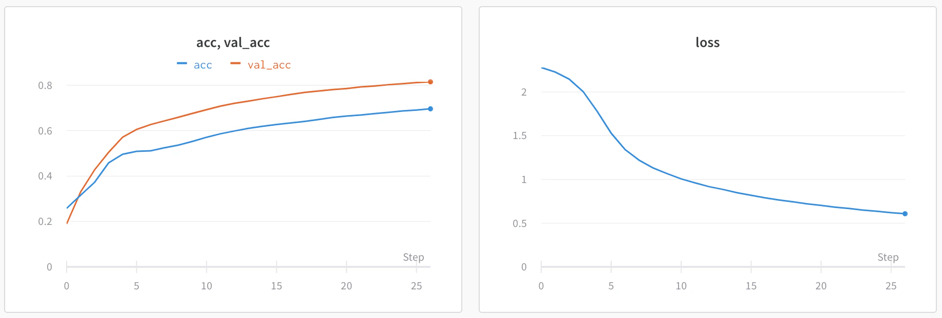
Add a line plot
The following sections describe how to create a line plot for a single metric or multiple metrics.- Single-metric line plot
- Multi-metric line plot
In an automatic workspace, W&B creates a single-metric line plot automatically for each logged metric. Follow these steps to re-add a line plot that was deleted from an automatic workspace, or to add a line plot to a manual workspace.
- Navigate to your workspace.
- To add a line plot globally, click Add panels in the control bar near the panel search field. To add a line plot directly to a section instead, click the section’s action () menu, then click + Add panels.
-
To add a single-metric plot with default settings, click Quick panel builder.
- In the Single-key panels tab, hover over a metric, then click Add. Repeat this step for each panel you want to add.
- Click Create [NUMBER] panels.
-
To add a custom line plot instead, click Line plot.
- Configure the line plot’s data, grouping, and display preferences using the corresponding tabs. For details, see Edit line plot settings.
- To add calculated expressions to the x-axis or y-axis, click Expressions. JavaScript regular expressions are supported.
- Select the type of panel to add, such as a chart. The panel’s configuration details appear with selected defaults.
- Optionally, customize the panel and its display preferences. Configuration options depend on the type of panel you select. For more information about the options for each type of panel, see Line plots or Bar plots.
- Click Apply.
Edit line plot settings
The following sections describe how to edit the settings for an individual line plot panel, all line plot panels in a section, or all line plot panels in a workspace. For details about line plot settings, see Line plot reference.Individual line plot
A line plot’s individual settings override the line plot settings for the section or the workspace. To customize a line plot:- Navigate to your workspace.
- Hover your mouse over the panel, then click the gear icon.
- Within the drawer that appears, select a tab to edit its settings.
- Click Apply.
- Data: Configure x-axis, y-axis, sampling method, smoothing, outliers, and chart type.
- Grouping: Configure whether and how to group and aggregate runs in the plot.
- Chart: Specify titles for the panel and axes, and configure legend visibility and position.
- Legend: Customize the appearance and content of the panel’s legend.
- Expressions: Add custom calculated expressions for the axes.
All line plots in a section
To customize the default settings for all line plots in a section, overriding workspace settings for line plots:- Navigate to your workspace.
- Click the section’s gear icon to open its settings.
- Within the drawer that appears, select the Data or Display preferences tabs to configure the default settings for the section. For details about each Data setting, see the Line plot reference. For details about each display preference, see Configure section layout.
All line plots in a workspace
To customize the default settings for all line plots in a workspace:- Navigate to your workspace.
- Click the workspace settings icon, which has a gear with the label Settings.
- Click Line plots.
- Within the drawer that appears, select the Data or Display preferences tabs to configure the default settings for the workspace.
- For details about each Data setting, see the Line plot reference.
- For details about each Display preferences section, see Workspace display preferences. At the workspace level, you can configure the default Zooming behavior for line plots. This setting controls whether to sync zooming across line plots with a matching x-axis key. Deactivated by default.
Visualize average values on a plot
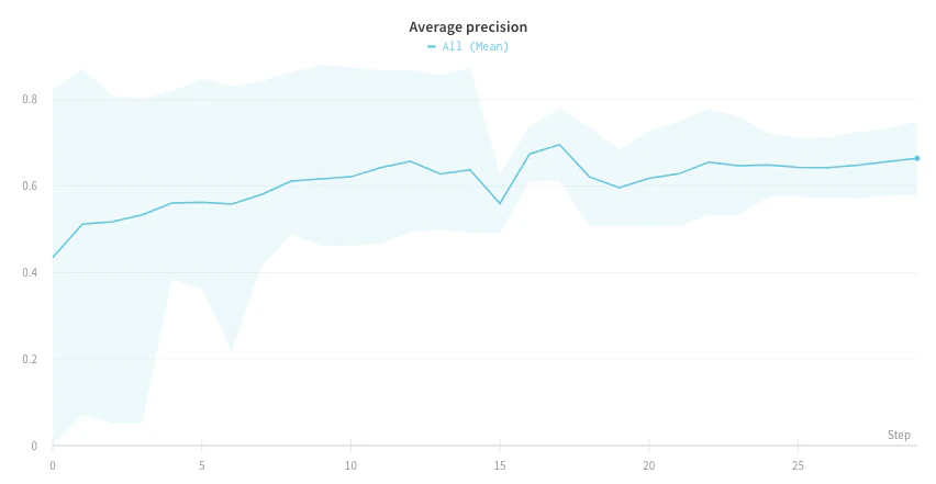
If you have several different experiments and you want to see the average of their values on a plot, you can use the Grouping feature in the table. Click Group above the run table and select All to show averaged values in your graphs. The following image shows the graph before averaging, with one line per run: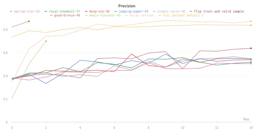
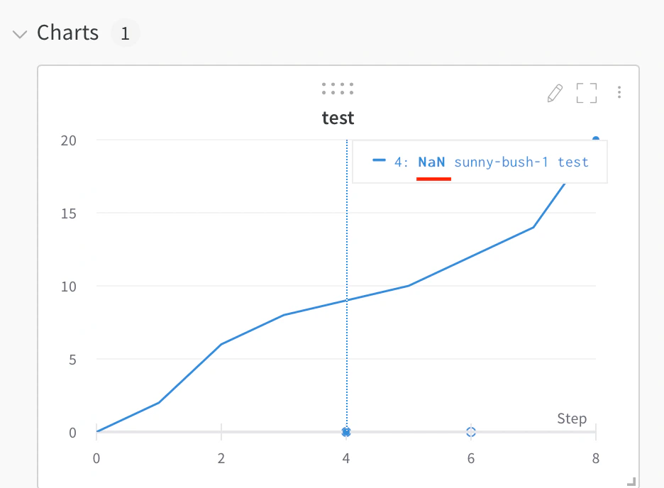
Visualize NaN value on a plot
To track metrics that might sometimes be undefined, such as a loss that returnsNaN, you can log them and W&B renders them on the line plot. You can also plot NaN values including PyTorch tensors on a line plot with wandb.Run.log(). For example:
Compare multiple metrics on one chart
To compare multiple metrics from one or more runs side by side, add a Run comparer panel to your workspace.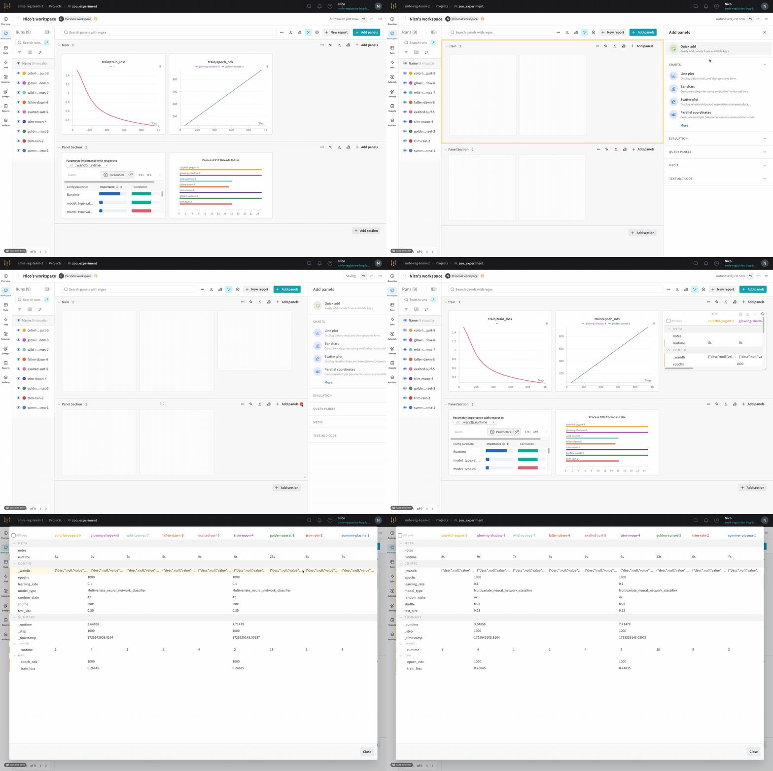
- Navigate to your workspace.
- Select the Add panels button in the top right corner of the page.
- From the drawer that appears, expand the Evaluation dropdown.
- Select Run comparer.
Change the colors of the lines
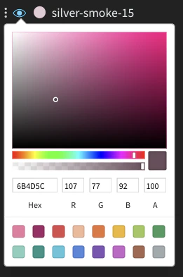
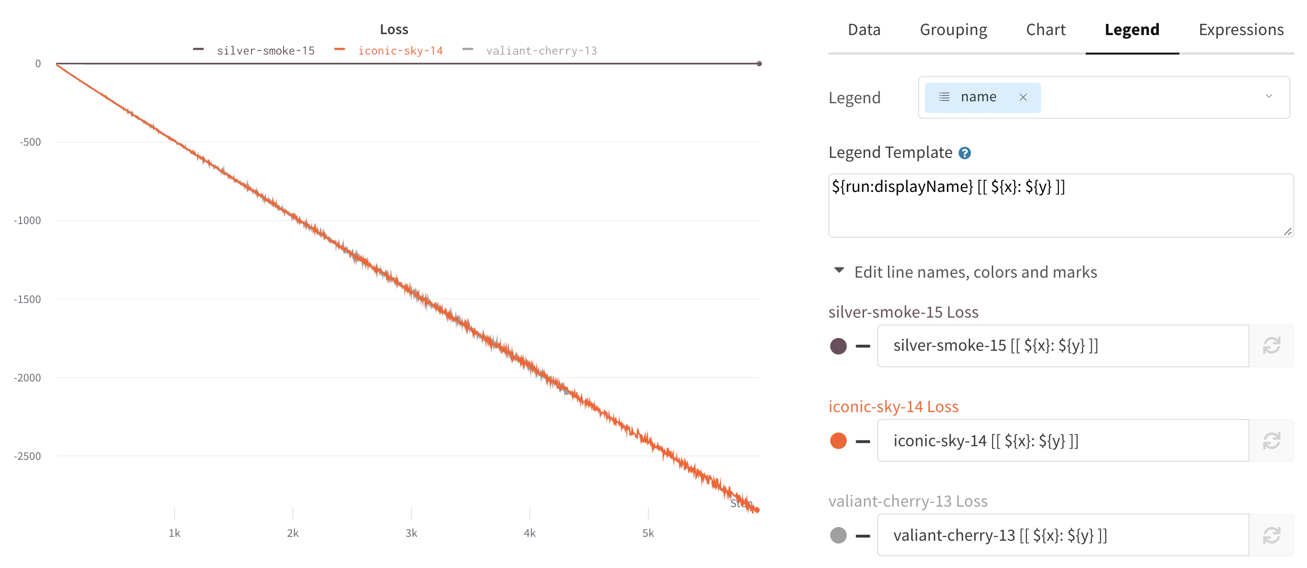
If the default color of runs isn’t helpful for comparison, W&B provides two ways to change the colors: from the run table or from a chart’s legend settings.- From the run table
- From the chart legend settings
Each run is given a random color by default upon initialization.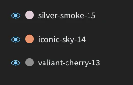
Visualize on different x axes
By default, line plots use training steps as the x-axis, but you can switch to a different x-axis to view your data from another perspective. If you want to see the absolute time that an experiment has taken, or see what day an experiment ran, you can switch the x-axis. The following example shows switching from steps to relative time and then to wall time.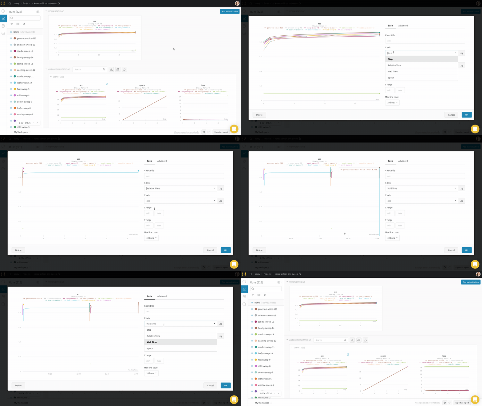
wandb.Run.log() where you log the y-axis. For example:
Zoom
To inspect a specific region of a line plot more closely, you can zoom in on both axes at once. Click and drag a rectangle to zoom vertically and horizontally at the same time. This changes the x-axis and y-axis zoom.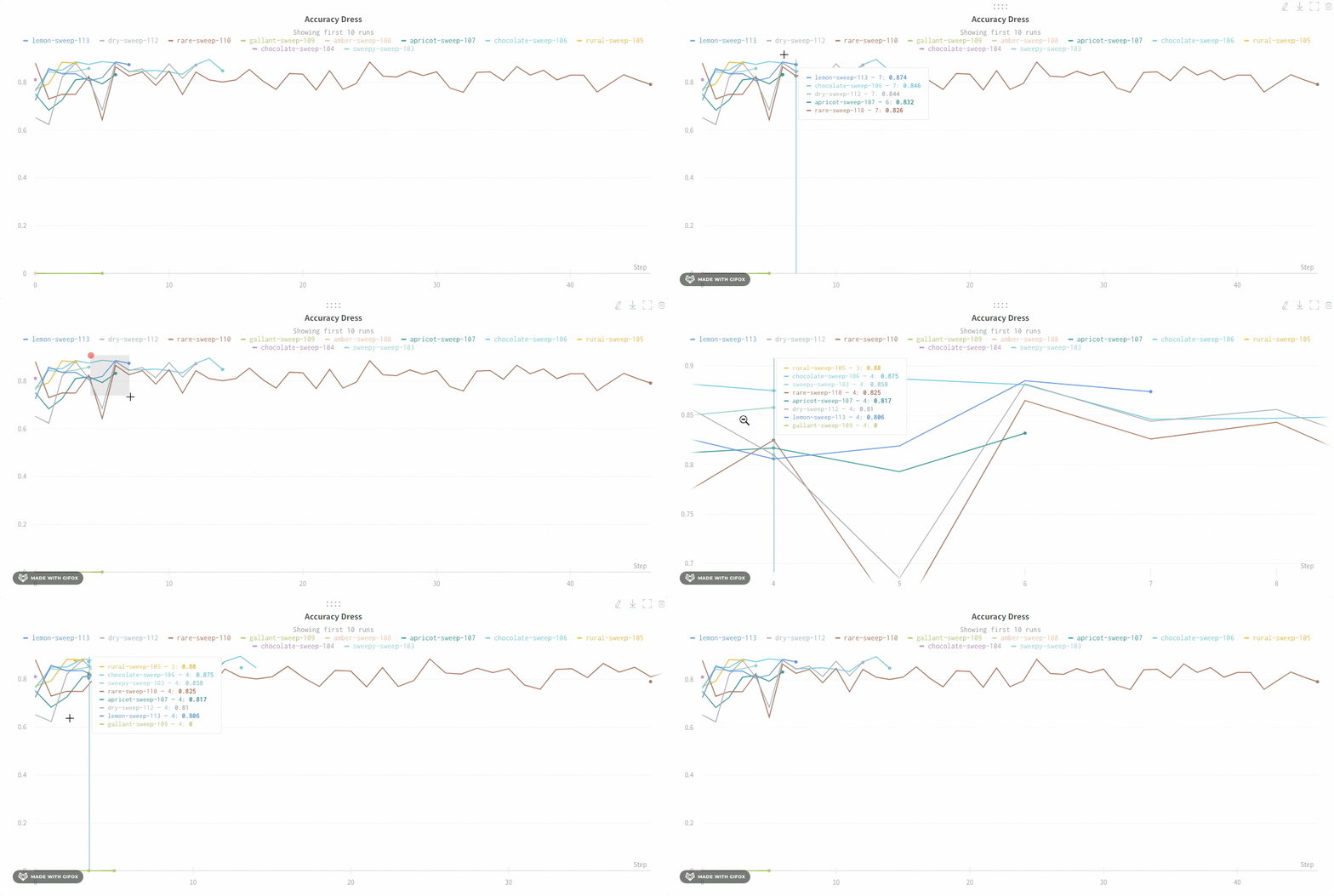
Hide chart legend
If the chart legend is taking up space you want to use for the plot, you can turn it off. Turn off the legend in the line plot with this toggle: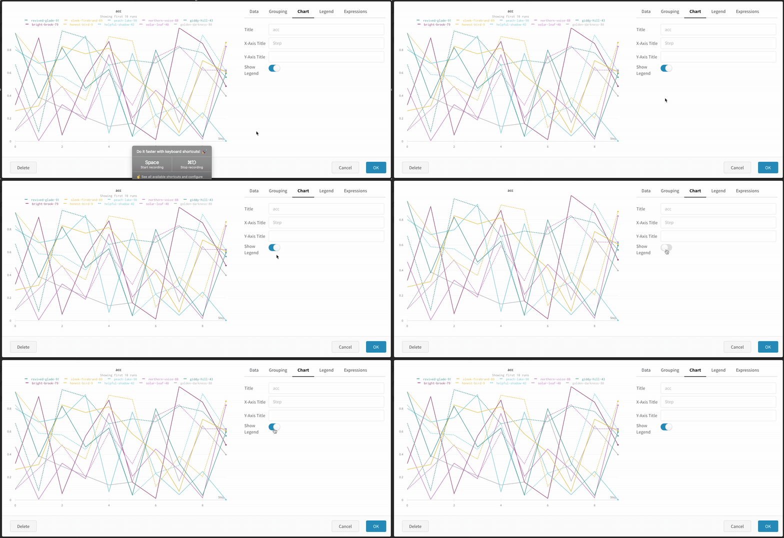
Create a run metrics notification
Use Automations to notify your team when a run metric meets a condition you specify. An automation can post to a Slack channel or run a webhook. From a line plot, you can create a run metrics notification for the metric it shows:- Navigate to your workspace.
- Hover over the panel, then click the bell icon.
- Configure the automation using the basic or advanced configuration controls. For example, apply a run filter to limit the scope of the automation, or configure an absolute threshold.